I’ve done brand and web work for nonprofits, booster clubs, and athletic programs around Kansas City. None of them had a real marketing budget. All of them needed to look legitimate. So this is the practical version: what actually matters, what to skip, and how to get there cheaply.
Let me start with why this matters more for you than for a normal business.
Why Nonprofit Branding Is Different
A coffee shop’s brand makes you want a latte. A nonprofit’s brand has to make you trust the organization with a donation, your email, or your kid’s information. Trust is the entire product.
That changes the priorities:
- Consistency signals legitimacy. A mismatched logo, three different shades of blue, and four fonts across your site read as “disorganized,” and disorganized orgs don’t get donations.
- Clarity beats cleverness. People decide in seconds whether you look real. A clean, plain brand outperforms a clever, confusing one.
- It has to work for volunteers. The people applying your brand are board members and parents, not designers. The system has to be simple enough that they can’t get it wrong.
Keep those three in mind and every decision below gets easier.
What You Actually Need (and What to Skip)
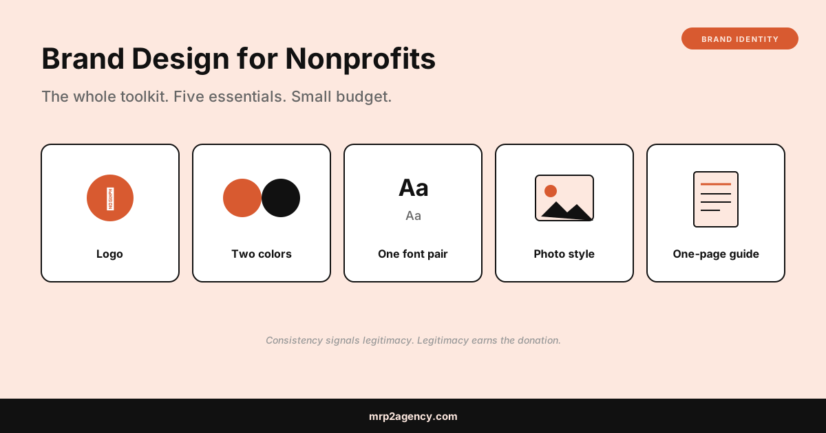
The agency version of a brand is a 60-page guidelines document. You do not need that. Here’s the minimum viable nonprofit brand toolkit that covers 95% of what you’ll ever use.
| Need it | Skip it (for now) |
|---|---|
| A clean logo (plus a one-color version) | Animated logo variations |
| Two brand colors with exact codes | A 12-color “extended palette” |
| One font pairing (heading + body) | Custom typography |
| A simple photo style rule | A full illustration system |
| A one-page brand cheat sheet | A 60-page brand book |
That whole list is achievable on a shoestring. The same “minimum viable” logic drives my brand identity guide for solo founders, because whether you’re one founder or a five-person board, the trap is the same: buying more brand than you need before you need it.
Step 1: A Logo That Works Everywhere
Your logo will appear on a website, a donation page, a printed flyer, a t-shirt, an email footer, and a social avatar. It has to survive all of them, including in a single color.
The rules:
- It has to read in plain black and plain white
- It has to be recognizable shrunk to a social avatar
- It should avoid fine detail that disappears when printed small
If your org runs youth sports or athletics, the crest-and-mascot considerations are a bit different, and I covered those specifically in how to design a logo for a sports team. For most nonprofits, though, a clean wordmark or a simple symbol plus your name is plenty. Don’t overcomplicate it. On pricing, the honest ranges are in how much a logo should cost; a nonprofit can get a solid mark from a freelancer for a few hundred dollars.
Step 2: Two Colors, Used Consistently
Pick two brand colors and use them everywhere, the same way, every time. That consistency is what makes a small org look established.
- Choose colors with intent. Blues and greens read as trustworthy and calm, which is why so many health and community orgs use them. That’s not a rule, but it’s a useful default.
- Write down the exact codes. Nail the specific values so your website, your flyers, and your printed banners all match. A free tool like Coolors makes building and recording a palette painless.
- Check contrast for accessibility. Nonprofits especially should be usable by everyone. Make sure text on your brand colors is readable for low-vision users.
Two colors, applied consistently, beats a rainbow applied randomly. Every time.
Step 3: One Font Pairing
You need exactly two fonts: one for headings, one for body text. That’s it. More than that and volunteers will mix them inconsistently and the whole thing looks messy.
Use Google Fonts, which are free, reliable, and work everywhere. Pick a clean heading font with some personality and a plain, highly readable body font. Then write down which is which so the next person doesn’t guess.
The goal isn’t a distinctive typographic voice. It’s consistency a non-designer can maintain.
Step 4: A Simple Photo Rule
Nothing cheapens a nonprofit’s brand faster than generic stock photos of fake-smiling models in a boardroom. Real photos of your actual work, people, and community beat polished stock every time, and they build more trust.
The rule can be as simple as: “Use real photos of our work. Keep them bright and warm. No cheesy stock.” Even phone photos, if they’re genuine and well-lit, outperform stock. This one costs nothing and matters more than people expect.
Step 5: A One-Page Brand Cheat Sheet
This is the piece that makes the whole thing stick. Put everything on a single page:
- The logo files and where to find them
- The two color codes
- The two font names
- The photo rule
- One line on tone of voice (“warm, plain, never corporate”)
Hand that to every board member and volunteer. That single page is what keeps a five-person volunteer team from drifting into five different-looking versions of your brand. It’s the difference between a brand and just a logo.
Doing It on a Budget
You can assemble most of this for very little. A few resources built for exactly this:
- TechSoup offers deeply discounted and donated software for verified nonprofits, including design tools.
- Google for Nonprofits bundles free tools that stretch a tiny budget.
- Canva has a free program for nonprofits with templates that keep volunteers on-brand.
Spend actual money on one thing: the logo. Get that done properly by a freelancer so you own real vector files. Everything else on this list you can do yourself with free tools and an afternoon.
What This Means for Your Organization
If you run or volunteer for a nonprofit, the takeaway is this: you need consistency, not a big budget. A clean logo, two colors, one font pairing, real photos, and a one-page cheat sheet will make you look more legitimate than most orgs three times your size. That legitimacy is what turns a hesitant visitor into a donor.
When a nonprofit brand is done right, it fades into the background and lets the mission do the talking. That’s the goal. When I build sites for organizations like this, the brand work and the website go hand in hand, which is exactly what the Kansas City nonprofit case studies walk through in detail.
Want help pulling a simple, trustworthy brand together without the agency price tag? Tell me about your project and I’ll give you a straight read on what your organization actually needs.