I’ve built brand and web work for youth clubs, high school programs, and athletic nonprofits around Kansas City, so this isn’t theory. It’s the same checklist I walk a booster board or a coach through before anyone opens design software.
Let me start with the thing that trips up almost everyone.
Why Sports Logos Are Harder Than Normal Logos
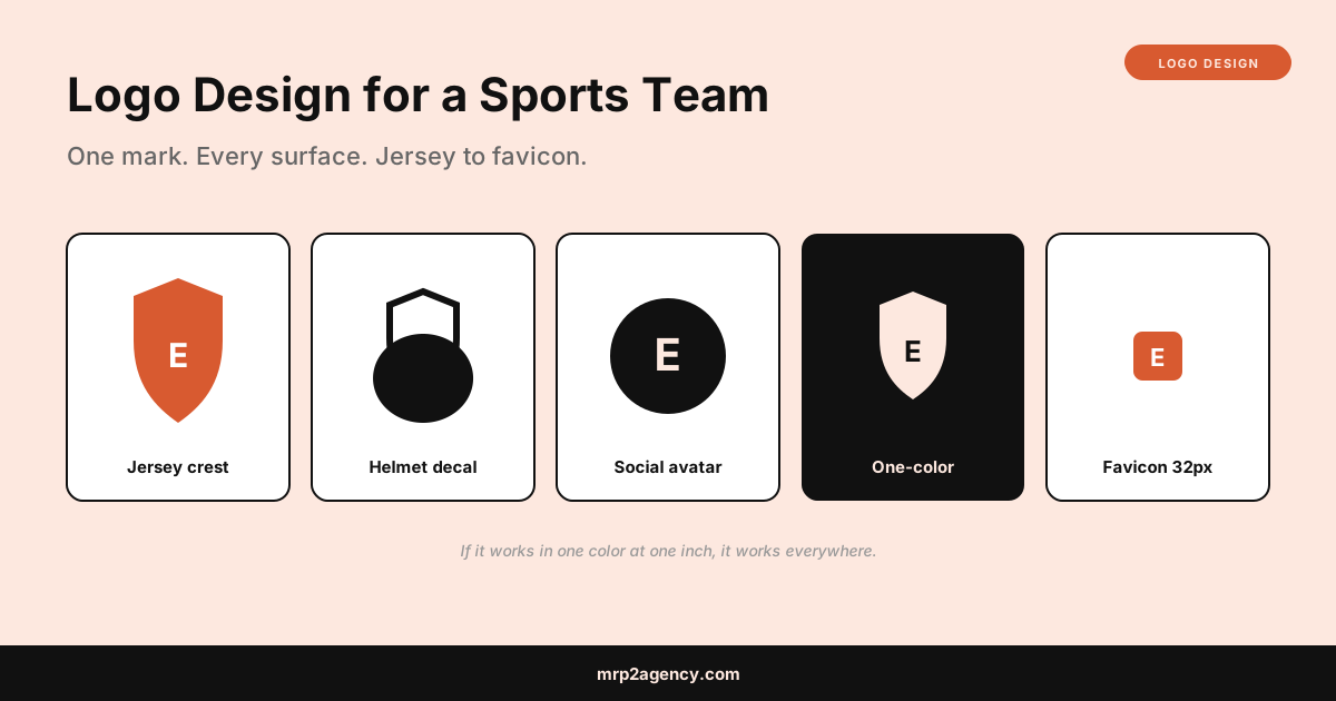
A normal small business logo lives on a website, a business card, and maybe a storefront sign. A team logo lives on all of that plus uniforms, equipment, water bottles, spirit wear, social avatars, and a scoreboard graphic. Each surface has different rules.
- Embroidery can’t reproduce fine detail or thin lines. Threads have a minimum thickness.
- Screen printing costs more per color, so a six-color logo makes every t-shirt more expensive.
- Helmet and equipment decals are small and often single-color.
- Social and app icons crop to a circle and shrink to almost nothing.
If you design a beautiful, detailed crest that only works at full size on a screen, you’ve made something the team can’t actually use on the field. The whole job is designing for the hardest surface, not the easiest.
Step 1: Define the Team’s Identity First
Before any sketching, answer a few questions. This is the discovery step, and skipping it is why so many team logos feel generic.
- What’s the team name and mascot, and is the mascot literal (an actual eagle) or abstract (just the letters)?
- What feeling should it project? Aggressive and modern, or classic and traditional?
- Are there existing colors the team is locked into (school colors, league requirements)?
- Where will it appear most: jerseys, a website, social media?
The same discovery logic applies to any brand project. I broke down the full version of it in how much a logo should cost, because the amount of thinking up front is exactly what separates a $50 template from a mark the team keeps for a decade. If you plan to design it yourself, a tool like Canva or the free Inkscape will get you there, but the questions above matter more than the software.
Step 2: Choose a Logo Type
Sports teams generally use one of three logo structures. Pick the one that fits how the team will actually use it.
| Type | What it is | Best for |
|---|---|---|
| Wordmark / monogram | Stylized letters (the team initials) | Clean, scales tiny, cheap to print |
| Mascot mark | An illustrated character or animal | Personality, spirit wear, youth appeal |
| Crest / emblem | A shield or badge combining elements | Traditional, soccer clubs, prestige feel |
Most teams actually need two versions: a full mark for banners and hero placements, and a simplified secondary mark (often just the monogram) for tiny uses like helmet decals and app icons. Design them together so they feel like a family.
Step 3: Get the Colors Right
Team colors are usually the least flexible part, since schools and leagues often mandate them. Work within that, but be deliberate.
- Limit to two or three colors. Every extra color raises the cost of every printed shirt and jersey.
- Pick colors that survive one-color printing. Your logo will get printed in a single color constantly, so it has to read in plain black or plain white.
- Get the exact values. Nail down the specific color codes so the jersey manufacturer, the sign shop, and the website all match. A free tool like Coolors helps you lock a palette, and jersey vendors usually want Pantone references so the “close enough” reds don’t look cheap across a full uniform set.
If the team is building a broader identity beyond just the logo, the same color-system thinking I covered in brand identity for solo founders applies directly. A logo is one piece of a system, not the whole thing.
Step 4: Design for the Smallest and Simplest Case
This is the rule that matters most, so it gets its own step. Design the logo to work in one color at one inch wide first. If it survives that, scaling up is easy. If it only works big and full-color, it’s the wrong logo for a team.
Practical tests before you commit to a mark:
- The black test. Fill the whole logo in flat black. If shapes merge into a blob or detail vanishes, simplify.
- The one-inch test. Shrink it to the size of a helmet decal. Still readable? Good.
- The circle crop test. Crop it to a circle like a social avatar. Does the important part survive?
- The embroidery test. Are there lines thinner than a shoelace? Thread can’t do those.
A clean mark that passes all four beats a detailed illustration that only works on a screen. Every time.
Step 5: Deliver the Right Files
Whether you design it yourself or hire someone, the team needs to walk away owning the right formats. The single most common way youth teams get burned is paying for a logo and only receiving one low-resolution image, then having to pay again every time a vendor needs it differently.
Make sure the final package includes:
- Vector source files (the master format that scales to any size without blurring). This is the one that matters most.
- Full-color, black, and white versions
- A horizontal and a stacked layout if the name is long
- PNG exports with transparent backgrounds for web and social
- The exact color codes written down
For a booster club or school program, storing these somewhere the whole board can reach them saves a future headache when a new volunteer takes over. That same “make it easy for the next volunteer” principle drove every build in my booster club web app case studies.
Common Sports Logo Mistakes
The failure patterns are predictable. Avoid these:
- Too much detail. A photorealistic mascot looks great on a poster and terrible on a hat.
- Trendy effects. Gradients, drop shadows, and 3D shine date fast and don’t print cleanly.
- Copying a pro team. Beyond the legal risk, it makes a local team look like a knockoff instead of its own thing.
- Year numbers baked into the main mark. “2026” in the logo means it’s stale in a year. Keep dates to a secondary version if at all.
- Only one file format. If all you have is a JPG, you don’t really own a usable logo.
What This Means for Your Team
If you’re a coach, a booster parent, or running a youth club, the takeaway is this: prioritize simple and versatile over flashy. A clean monogram or a simplified mascot that works in one color at one inch will serve the team for years across every jersey, banner, and app. A complicated crest that only looks good on a screen will fight you on every order.
You can absolutely do a solid job yourself with the tests above, or hire a designer who runs a real process and hands over the full file package. Either way, the standard is the same.
Want help designing a mark for your club, program, or league, or building the site to put it on? Tell me about your project and I’ll give you a straight read on what your team actually needs.